Mest 2 Evaluation
I addressed the music promotional video brief and the print
magazine brief, intending to advertise the band to a wider audience through these
media. In my first production I helped organise everyone, planning the days we
were filming by talking to each member of the group to find out when they were
available. I also participated in most of the brainstorming, coming up with the
ideas for the band’s look and how we wished to portray them in the video to
make them seem educated and interesting; and deciding on where to film to make
sure the video was most aesthetically pleasing. In my second production, I
hoped to achieve a similar effect to that of the video; to advertise the band
to a wider, less niche audience by portraying the members as confident and
intelligent, through imitating the look and text of a real NME Magazine article
to make it look as genuine as possible.
The music promotional video was intended to target a ‘largely
youth-based market’ while still promoting the act in a way that would ‘appeal
to more than just a niche audience’. We achieved this through researching other
music videos; analysing their use of concepts including setting, themes and icons,
along with textual analysis of their production features such as mise en scène,
sound and camera effects, and editing techniques. I noticed that most music
promotional videos were around 2 minutes long and featured clips from music
videos, interviews, live shows and recording sessions, and often extras such as
interviews with fans or managers, and ‘behind the scenes’ clips of the band to
show them as real people, giving the video a personal, ‘exclusive’ tone. For
the setting, I thought Southend coast would be ideal because it’s iconic and
versatile; we could film the beach, the theme park, and all the lights and it
would look like multiple locations. I also scripted what the band were going to
say in their interviews so their personalities appealed to our audience and
they came across as interesting and educated. We also included relevant mise en
scène where necessary, such as instruments and recording equipment, and paid
attention to the clothes and make up worn by our ‘musical influences’ such as
Marina and the Diamonds.
In the print based production brief, I had the same
intentions to promote the band, but through a magazine article. I researched
many different magazines, and analysed the audience and reader profiles to see
which most matched the one created for the audience of our band; pre-teen to
young adult males and females. I also looked at the other genres of bands
advertised in each magazine; Kerrang! has more of an alternative or emo genre,
and fashion magazines like Elle were more highbrow, appealing to an older audience
than would have suited our act. I came to the conclusion that an NME style
album review and interview would be best to promote an act of our pop-indie
genre. In NME, I saw that most album reviews followed the same strict formatting
on one page, with one photograph, and large headings and subheadings to show the
band name and that it was a review. The language is also very stylised and
personal, like the reader is being recommended music by a friend, concluding
with a rating out of 10. So I recreated the same layout, replacing everything
to show our band as the type of band whose review would be found in NME. I
noticed that most images in the magazine showed bands with dull facial
expressions to show their attitude, which represents lifestyle that the readers
would aspire to. I used this idea when taking the photo for the interview, because
it is a full page and would catch the reader’s attention. For the interview
double page, I also included a large headline of a quotation from the interview
itself that was colourful and eye-catching in a font influenced by that of the
template article I was following. By using all these techniques, the production
was created to appeal to ‘more than just a niche audience’.
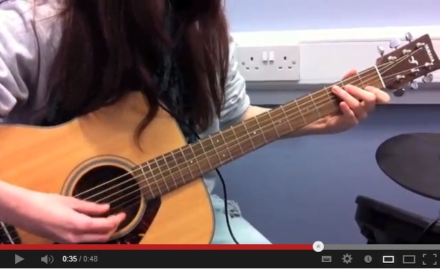
The first production featured clips from a ‘music video’ of
one of the songs from the album, a ‘live’ recording session including an a
acoustic version of the song that the my band members actually recorded, and interviews
with the members about their tour. It also showed the band logo as well as
advertised the dates of the tour. Its strengths are in the mise en scène
details such as the recording equipment, and the setting. The clip of the ‘music
video’ is most effective despite it being short, because it is very aesthetically
pleasing and eye-catching and looks like a genuine music video. Another success
was the band members themselves, because they played their roles well and
looked the part throughout the entire video. The clips of them messing around and
joking together represent a verisimilitude that seems completely genuine and
entertaining to watch which helps appeal to the audience. The weaknesses are
sound and video quality because some moments are blurry or pixelated,
especially the interviews, and it is hard to make out what is being said. Also,
some of the transitions look unprofessional despite using the software we did
(Premiere Pro) simply because it was so difficult to use at first.
The print production was made up of three pages; an
interview, a picture and a review, all designed to look like real pages from an
NME magazine. Every detail was analysed; fonts, images, layout, language and
text size, along with all the personal features that the institution uses, such
as the logos and page numbers. It is successful in that it looks like a genuine
extract from the magazine, and reading the text, the band represents everything
that had been aimed for as well as providing entertainment, information, and
personal identification to the audience through techniques such as having “We’re
still not cool” as the headline title; it lets the audience identify with the
band members. The weakness of my second production is the fact that not all of
the details are correct; such as fonts being a closest match not the actual
thing, and that my photo editing skills are not very developed and therefore
the images don’t look very professional.
For the practise video production, we edited using Apple
iMovie. It was successful enough, but we decided to really push ourselves and
attempt with the professional software instead for the final draft, teaching
each other and learning as we went along. In the long run, this made a
difference and was successful; however it was more difficult to get started
because the programme is so hard to get used to. Another change we made was
that when we began producing the band and the video, the band had four members;
two girls, two boys. We had planned this in the hopes that because of the gender
diversity they would appeal to a wider audience, and it allowed us to use
backing tracks featuring both female and male vocalists. However, the day
before we were due to film, one of the male actors decided he did not want to
be in the video any more, resulting in a massive rethink about the entire
project. After analysing successful girl bands such as First Aid Kit, and bands
with female singers like Marina and the Diamonds or the XX, we decided that
rather than having two female members and one male member, we would instead
have simply the two girls and use our male actor as a manager figure to feature
in interviews. Using one boy seemed random, and with girls only we could focus
on a more ‘girl-power feminist’ slant in the print articles. When it came to shooting,
we had also planned to film more in an arcade because the lighting and 80s mise
en scène would make a good setting for the video, however when we came to do so
we discovered that filming was prohibited. Therefore, we made the most of what
little footage we were able to get and shot some more outside instead.
If I had decided to produce the third, e-media brief instead
of the print, I would have included lots of images of the band in more of a
professional photo shoot setting, along with background information on how they
were formed and each member individually on an ‘About The Band’ type page. I
would have also included ‘adverts’ from institutions that would have appealed
to the audience of the band; for example, Converse All Star, Urban Outfitters
or Apple Inc.
To conclude, I have
learnt many things from research to final productions. I have developed my
skills of organisation, and my knowledge about forms and conventions of video
and print based media texts and how to replicate them. I have also learnt through
trial and error to use Premiere Pro and InDesign. Not only that, but I have
improved my team work skills and patience through working under pressure.