

This title clip was made using an establishing shot of the sun, and adding video effects post-production in iMovie, which allowed us to give it a retro looking colour filter, add lens flares and text. However, I think it would have been more successful had we been able to use the actual band logo instead of simply typing the name out, because the font does not look very professional. Also, the title is on the screen for less than one second, and it appears a little rushed.

I think the colours and film grain type effects on this clip work extremely well to create an indie feel to the video, and the general composition of the shot was successful, your eyes being drawn to both Leia and Daisy without it looking as boring as it could have had they just been standing on the ground.

This two second clip would have worked better had we panned over it more so it was more obvious that it's the album cover, because it just fills the screen and looks like a random title page and seems to break up the rest of the video. On the other hand, the non-diagetic voice over of Daisy talking about the album over it worked extremely well and looks very professional.
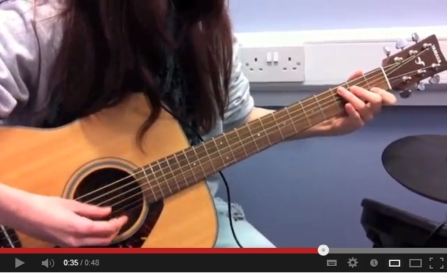
This shot I think could have been more successful than it was- the close up on the guitar works- however I don't like the plug in the background or the edge of the drum on the right hand side as they distract from the guitar and Leia. To improve this shot we would make sure there is nothing else in the shot that could distract from the main focal point and make it look overcrowded.

This clip is successful because even though it's from the same take as the first shot of Daisy singing, the grayscale effect make it look different, not repetitive at all. I think this is something to consider when we make our actual video, that depending on the effects, colours, or filters used, a shot can be totally transformed and maybe even used more than once in the same video.

The end of the video seemed a tiny bit rushed, which is another thing to consider when we make our final video- that maybe using the very end of the song would have added more of a finale tone to it than just a fade out. However it is good this way too, it would work to go out with more of a bang to be memorable as it is a promotional video meant to advertise the band and would stick in people's minds better.
